In this behind the design post, we’re turning back the clock to revisit one of our favourite ever custom brand design projects. Ahoy Naturally approached our team back in 2015 looking for the perfect branding to suit their growing business. To this day, it’s one of our team’s favourite logo projects, and we couldn’t help but show you more of our process on this one.
Ahoy Naturally is a homemade cosmetics brand based in Oxford, UK. They produce 100% natural products that are celebrated by their customers, many of whom return time and time again for the excellent quality and ethics of the Ahoy brand. The Ahoy Naturally team are dedicated health enthusiasts who truly love helping others understand the brilliance of nature and what makes skin happy. When it came to their custom branding, we wanted to make sure that the Ahoy Naturally values and principles were reflected throughout.
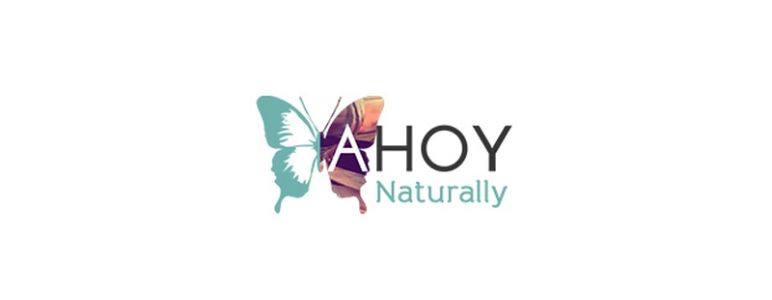
Our brief was to create the Ahoy Naturally team a delicate and beautiful logo that they could use throughout their business. This meant that it needed to stand out in its own right but also continue to look fantastic when scaled down to fit on their product labels. Ahoy Naturally wanted us to incorporate a butterfly motif into their logo design to represent the new lease of life their products give to neglected skin. Using the butterfly image as a starting point, we began our custom logo design process.
The meaning behind the butterfly image told us that Ahoy Naturally wanted their values of health, kindness, and nature to run throughout their branding. These values have underpinned the business from the very start, with “Ahoy” itself literally meaning “hello” in Slovak, the first language of Ahoy Naturally’s founder and lead creator. With Ahoy Naturally extending a direct and friendly greeting to each and every customer through their business name, we knew we had to match their brand voice with an equally warm and welcoming colour palette.
We opted for teal as the principal colour, allowing Ahoy Naturally to use both black and white as off-set contrasting colours on selected packaging and simplified versions of their logo. In the full design, we also added an intentionally nondescript image containing sunset colours, adding to that warm feeling without complicating the clarity of the logo when downsized for smaller product packaging.
We overlaid the Ahoy name with the butterfly motif itself, which meant that when it came to the social media logo it was easy for us to isolate the butterfly image and take this through to the final thumbnail design. Keeping the “A” from “Ahoy” fully present in the butterfly wing allowed us to maintain a sense of identity in the custom thumbnail design. We’re really happy with how this design in particular turned out.
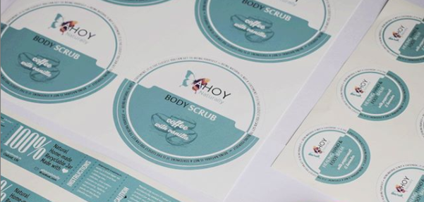
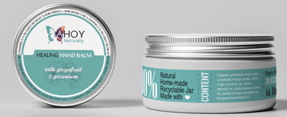
Having since seen our designs come to life on Ahoy Naturally product labels, we’re so proud of our work on this project and it continues to be a firm favourite design among the Kartogram team to this day. To see more of this project, check it out in our portfolio.
If you like what you see here and want to talk about the branding for your business, please get in touch with Kartogram today. We’d love to talk about what your business means to you and create you the perfect branding that helps to tell your story.