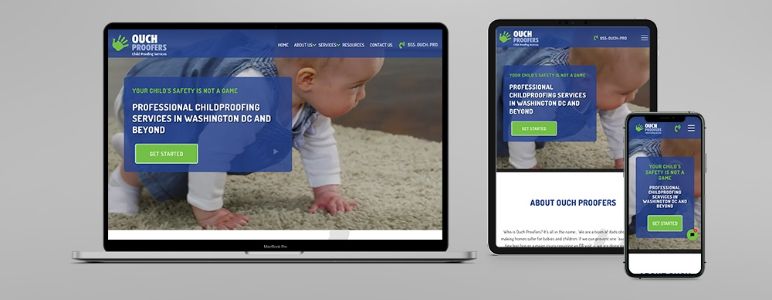
It can sometimes seem like websites with certain colour palettes get all the attention. Along with a great logo and clear content, a stylish colour palette can be the key to unlocking your business’s branding potential – so make sure that you spend the time making the right choice!
“But how?”, we hear you ask…
Well, it’s slightly more complicated than just choosing your favourite colours and throwing them together. Custom web and branding design is a finely balanced art that must take a number of different things into account in order to get it right, including:
- The mood / aesthetic of your business
- Your customer base / target audience
- Your existing content
The Basics
Generally speaking, designers recommend sticking to a three-colour palette for most branding projects. If you already have your logo design signed off and ready to go, then this can be a great place to start when choosing your principal website colours as it will ensure that your existing branding remains consistent and cohesive. Begin by choosing two colours from your logo that go well together, then build on this by choosing a third colour that acts as an accent. On many websites, you’ll find that the principal three colours are weighted with roughly 60:30:10 proportions, so bear in mind which colour you might want to be your “lead” when it comes to your final design.
If you don’t yet have your logo design, begin by thinking about the aesthetic or feel of your brand. How do you want your audience to feel when browsing your website? What does your product or service aim to help with, and what mood does that evoke? Think about your audience – what sort of person is your target customer and which colours might reflect their interests?
Moods & Variations
When you think you’ve chosen your main two or three colours, spend some time playing around with different variations of tone. Colours have moods – warm, neutral, and cool. It may well be that tweaking your palette slightly to lean towards a particular mood will help you to capture the brand aesthetic you’re looking for.
Alternatively, if you’ve chosen two principal colours that work well together in neutral tones, perhaps your third accent colour will be where you can incorporate mood into your palette. How might cool or warm tones change the feel of your website? How well does this feeling capture the aesthetic of your brand?
Black & White
Depending on your custom website design, it may be that monochrome elements (black, whites, or greys) also form part of your overarching colour palette. For some businesses, black and white act as the primary two colours of the design palette, whilst for others, monochrome accents are an addition to the existing three-colour base design.
Every brand is different – play around with how things look and be sure to ask your custom web designer to incorporate monochrome elements if you feel it could add dimension. Don’t forget about grey, either. If you’re looking for a softer way to add light or depth to your design, consider different shades of grey as opposed to white or black. You might be surprised with the impact you can achieve.
Not only does your colour palette express the feel of your brand to your customers, it can also become a key signifier and marketing tool for your business once you become more established. How many brands can you think of that are recognisable simply from their branding colours? It’s really important to spend the time getting your colour scheme right in order to ensure maximum return on investment from your custom web design project.
Have you got a custom web design project up that could do with a helping hand? We’ve got you covered. Here at Kartogram, we’ve been supporting large and small businesses with their website and branding designs for over a decade. Whether it’s your colour palette, your logo design, or building your website itself – we can help you to get the best from bespoke design. Get in touch with the Kartogram team today to learn more.


