
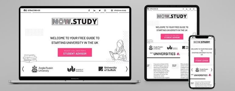
Responsive web design (RWD) is the term used to describe websites built with flexible capabilities, allowing sites to appear seamlessly and perfectly on any screen size or device. Custom web design components like text, logos, images, and blocks can all appear differently depending on the device used to load the website, adjusting to comfortably fit the given screen size with no errors or glitches.
Seems like a simple idea, right? In this post we’ll briefly outline why this seemingly minor design element is majorly important to consider when it comes to custom web design.
The average amount of time per day that a person spends looking at a screen is about 4 hours, which may seem like a large window of opportunity to get your website out there. However, it takes on average less than 15 seconds for most people to decide whether they’re going to stay on a website or not, which is why it’s important that your website loads quickly and looks professional - on any screen. Those 15 seconds are vital for making a first impression on your audience. Having a responsive website allows you to get this right every single time, as well as improve the overall user experience (UX) of your website.
If that’s not convincing enough, responsive websites also tend to rank more highly on Google search results. Google recommends responsive websites to its users first and foremost, so even with all the SEO and marketing in the world, you’ll still need your website to be responsive if you want to appear at the top of any search results. SEO itself also becomes easier with responsive web design, as you’ll no longer have to work from both a mobile version and web browser version of your website. You’ll only need to update your copy and retrieve your analytics and stats once as both versions of the site are combined. This ultimately saves you time and money!
It’s important for your website to incorporate responsive web design, but it’s even more important that this responsive web design is designed and implemented well. That’s why your choice of custom web designer is key to getting things done properly. If your website experiences problems between mobile and web browser display, or won’t load seamlessly on a particular device, your audience will quickly become frustrated and leave your site altogether. Equally, if all of your content loads properly but there’s incontinuity between the mobile and web browser sites - for example, if an image that looks great on a mobile screen loads with low resolution on a desktop - once again your audience will give up and look elsewhere.

At Kartogram, we ensure that responsive web design is an integrated part of what we do. We work hard on all of our custom web design projects and responsive web design is part of our standard process when we build websites from scratch. We’ve got so much experience with responsive web design, we also help to integrate responsive web design into existing websites to help improve traffic and results.
Contact the Kartogram team today for more advice about responsive web design and find out what we can do for you in your next custom web design project.